Environmental background portraits, whether shot in an office, studio, or outdoor location, are powerful when they match the story you are trying to tell. When your images must align with broader brand guidelines, a professional consultation helps ensure everything from color to crop supports the same message.
The Psychology of Color in Professional Headshot Backgrounds
Viewers make snap judgments about competence and warmth in a fraction of a second. The background color behind your face plays a measurable role in those judgments. Research in consumer psychology has found that blue backgrounds trigger trust in 74% of viewers, while warm-colored backgrounds increase perceived warmth and favorable attitudes toward the subject.
Here is how common background colors read in professional headshot photography:
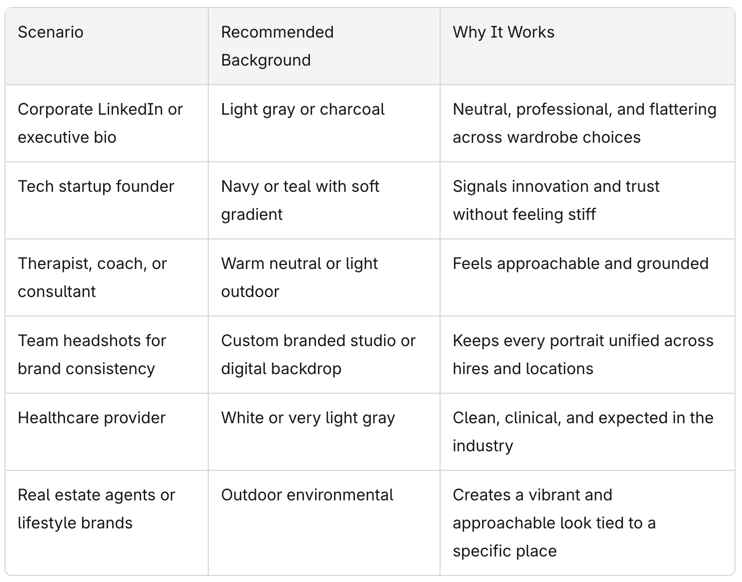
- Blues (navy, teal): Support trust and stability. Favored in finance, consulting, and B2B.
- Grays (light gray, charcoal): Gray backgrounds communicate neutrality and sophistication. They signal logic and professionalism.
- Blacks: Black backgrounds convey authority and creative edge, but can feel distant or severe in the wrong context.
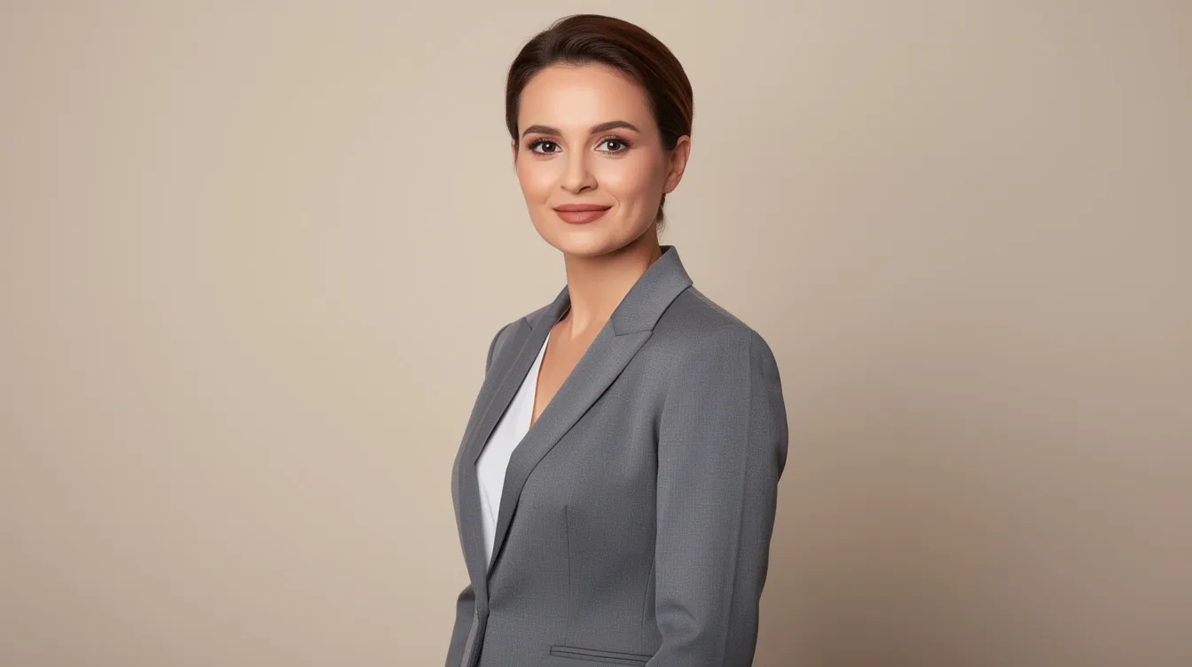
- Warm neutrals (beige, taupe, cream): Warm tones like beige read as approachable and grounded. Ideal for client-facing roles.
Background color also interacts with skin tone and wardrobe. A small shift from white to off white can soften the look dramatically, reducing harsh contrast that washes out lighter complexions. Companies with strong brand consistency often tie background colors directly to their brand palette so that headshots feel native to every platform where they appear.
Studio Backgrounds: Solid Colors, Gradients, and Textures
Studio backgrounds, whether solid, gradient, or textured, offer the most control and repeatability for professional headshots and team headshots. Artificial backgrounds offer complete control over color and lighting, which is why studios remain the default for high-volume corporate photography. The key options include light gray, charcoal, dark gray, navy, white, black background, warm neutrals, soft gradients, and subtle textures.
Different studio backgrounds work for different industries:
- Finance, legal, consulting: Light gray, charcoal, navy.
- Healthcare and government: White or very light gray.
- Creative and tech: Teal, soft gradient, textured backdrops.
Studio backgrounds also make it easier to maintain brand consistency year after year, even as teams grow.
Light Gray: The Most Versatile Professional Headshot Background
Light gray is the most popular professional headshot background for good reason. It serves as the universal starting point across industries and has held that position from 2024 through 2026.
Light gray delivers several practical advantages:
- It flatters most skin tones without casting unwanted color.
- It works with both dark and light suits, creating clean separation.
- It looks polished in LinkedIn's circular crop and dark mode interfaces.
- It photographs more gently than pure white, avoiding washed-out faces and harsh contrast.
For companies without defined brand guidelines or for mixed-role team headshots needing a shared, neutral look, light gray is typically the safest starting point. Slight tonal shifts, cooler versus warmer gray, can better align the simple background with a specific brand color palette.
Charcoal, Navy, and Dark Studio Backgrounds
Charcoal backgrounds project authority and gravitas in portraits without the severity of a true black background. Navy blue backgrounds convey trust and competence in headshots, making them a classic choice favored by banks, insurance firms, and established B2B brands.
Darker backgrounds work better for formal industries like finance and law because they:
- Emphasize facial features and eye contact through natural contrast.
- Pair well with executive portraits used in annual reports and investor decks.
- Create a tone of seriousness that matches audience expectations.
Concrete examples: a CFO of a regional bank on a navy gradient, or a law firm partner on charcoal with a subtle vignette. Both read as deliberate and authoritative.
One critical detail: darker backgrounds need careful exposure so dark suits do not blend into the background. Without a light separation edge, a rim light, or an accent, the person can disappear into shadow. Darker backgrounds convey authority and professionalism in headshots, but only when the photographer manages contrast properly.
White, Warm Neutrals, and Subtle Textures
White backgrounds are standard for healthcare provider headshots and government profiles where clarity and simplicity matter most. White backgrounds signal clarity and premium quality, but pure white can overexpose skin or reflect light harshly, so many photographers recommend off white as a safer alternative.
Warm neutrals, including beige, cream, and soft taupe, are ideal for client-facing professionals like real estate agents, therapists, and coaches who want their portrait to feel welcoming. These tones photograph beautifully under soft studio lighting and create a natural warmth that a solid background in cooler tones cannot replicate.
Very subtle textures or mottled studio backdrops add depth and dimension without turning into pretty pictures that distract from the face. The texture should read as an interesting wall when slightly blurred, not as a busy pattern or wallpaper. Test wardrobe against these backgrounds before the shoot to avoid blending, such as a beige blazer on a beige backdrop, and watch for color shifts under cool lighting.
Environmental Backgrounds: Using Real Locations to Tell a Professional Story
An environmental background uses a real location, an office, lab, city street, or workshop, rendered in soft focus behind the subject. Environmental backgrounds use existing settings for context, adding narrative weight that a plain studio wall cannot provide. A blurred background can separate the subject from distractions in the environment while keeping the space recognizable. Depth of field should be
shallow in headshots to avoid distractions behind the subject, typically using apertures around f/2.8 to f/5.6.
Common professional settings that work well:
- Modern office lobby or conference room
- Glass-and-steel corporate campus
- Industrial space for engineering or manufacturing
- Studio, workshop, or clinic for creatives and healthcare
The environment should align with the brand's real-world presence. Shooting a remote-first tech company in a random coworking space that does not match their culture creates a visible disconnect.
Office and Workplace Backgrounds
A softly blurred office background can communicate credibility, scale, and professionalism in a single frame. The camera captures just enough context to tell a story without overwhelming the person in the image.
Concrete examples of office backgrounds that work:
- An architect with blueprints on a table and a skyline through a window.
- A nonprofit director with branded signage and volunteers softly visible behind.
Avoid clutter: cords, paper stacks, personal items, and harsh overhead lighting can undermine an otherwise strong professional headshot. Environmental headshots require careful planning for time of day, window direction, and color temperature of office lighting. When the edges of the frame contain distracting elements, the viewer's focus drifts away from the subject.
For multi-office teams, digital or studio backgrounds may still be better when strict uniformity is non-negotiable.
Outdoor Environmental Backgrounds
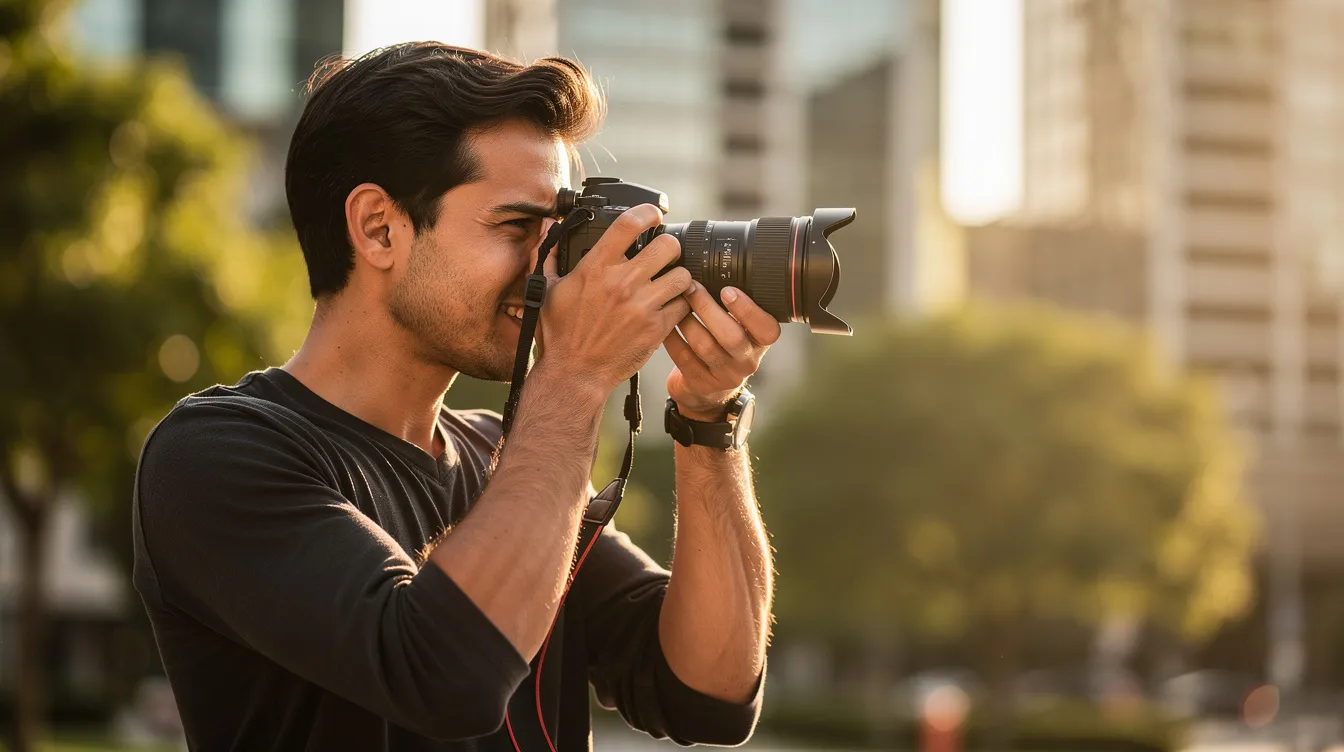
Natural outdoor backgrounds can create a vibrant and approachable look that traditional studio setups rarely achieve. Outdoor settings establish geographic identity and add a bit of personality to the portrait.
Outdoor backgrounds are recommended for:
- Personal branding for consultants and coaches
- Real estate agents and lifestyle service providers
- Creative professionals whose work ties to a specific city or nature
Practical details matter: schedule during early morning or late afternoon light, use shaded areas, and look for simple lines from buildings or trees that blur into soft color and shape. Midday sun and busy traffic or bright signage can make outdoor professional headshots look amateur and chaotic.
Use shallow depth of field to create bokeh and reduce visual noise while keeping recognizable hints of the environment. The combination of a real location and intentional blur gives the portrait context without competition.